I don’t know, but it totally sounds legit doesn’t it?
Erm … I’m totally speechless on this 


Well, to be honest, I did not like the “icon” version of the proposed logo. I tried to resize to 16x16 and it doesn’t looks cool (in case of favicon). Also, it doesn’t quite relates to the logo, except for the lightning bolts. Anyway, just my two cents.
Ok, after some talking with my friend, here’s some updated idea regarding the logo and the 1:1 icon (with colors):
Logo
600x465
300x232
150x116
80x62

1:1 icon
16x16
![]()
32x32
![]()
48x48
![]()
96x96

1 Like
Awesome! 
My only comment would be to take the color down on the “framework” to maybe a dark gray to not make it three colors. (But I am in no way a designer, I reserve the right to withdraw my comment if proved wrong).
Anyone opposed? Maybe we can adopt it with the 18.12 release.
Hi latest looks very spiffy. Any chance of including some sort of homage to the old logo? - just thinking out aloud
cheers
My only comment would be to take the color down on the “framework” to maybe a dark gray to not make it three colors.
I have the SVG here, I can change the colors to whatever we want, actually … I really just found the 1:1 icon still a little bit strange - I already told him that, let’s see what happens.
Well, actually, the “old logo” was not actually a logo, it’s @channelcat’s avatar … We are now creating the Sanic logo, so to speak 
Serves me right for being a Johnny Come Lately 
Still the “gotta go fast” meme does fit well with the non-blocking, evented nature of the framework … The spiky S is homage I guess.
Yeah, well, that’s what we got for free so far … I’m also a fan of the “gotta go fast” meme, but we need to find a visual identity of our own, nevertheless 

2 Likes
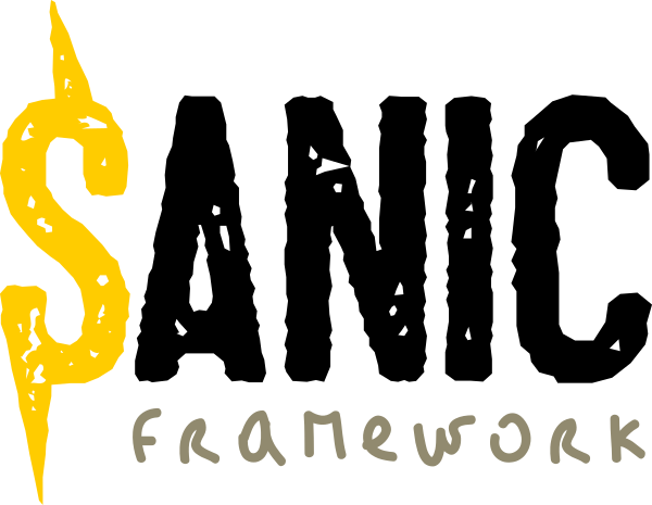
I got some ideas along this line. The “Sanic” part should convey insanely fast and the “framework” part should convey stout and secure. The previous mockup had it reverse. I will do some mockup for you guys, if you don’t mind. You will like the direction. Its simple and relatable.
2 Likes
@sy1492 every mockup is more than welcome! I just got these ideas from a friend of mine, that’s doing this in a “pro-Bono” way - literally speaking when he have some spare time to do so.
@LaughingBubba thanks a lot for helping on this as well. As I said, every mockup and idea is more than welcome so we can end up with a community framework and, perhaps, a community made logo!
1 Like
@LaughingBubba I got an idea from a friend to use a greyhound (since dogs are friendly, plus greyhounds may look funny sometimes) to build some kind of “mascot” for Sanic. Going here and there, with some of your sketches, I ended up spending some time myself on inkscape … And this is the result, so far (I’m open to suggestions!):

2 Likes
My impressions, FWIW,
- Parallel lines are good because they evoke async streams.
- The S with a line evokes a currency symbol: $
- I love dogs, but in some cultures, dogs are considered unclean.
- That said, greyhounds are superlative pets, gentle, quiet, fast.
I think it’s quite hard to please everyone … I’m almost thinking that the logo should be a simple code. Not some SVG code, just sanic, monospaced 
Hey… it works for Google…
Yeah, well, the first Google logo was almost a WordArt, so … I just thought we could get a head start on that 
- The S with a line evokes a currency symbol: $
That’s why I never continued with that idea.