New project logo

Hello, everyone!

As one of the things I would like to see in Sanic is a specific project logo, not tied to the past and that would bring a sense of community for all of us (and identity, of course).

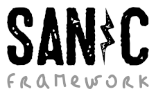
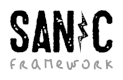
For this reason, I asked a friend (who’s a graphic designer) to come with some ideas regarding the word Sanic, what it is, the goals of the project and our new spirit of “community based project”. With this in mind, he brought to me some ideas (all sketches), using a urban grafitti approach:


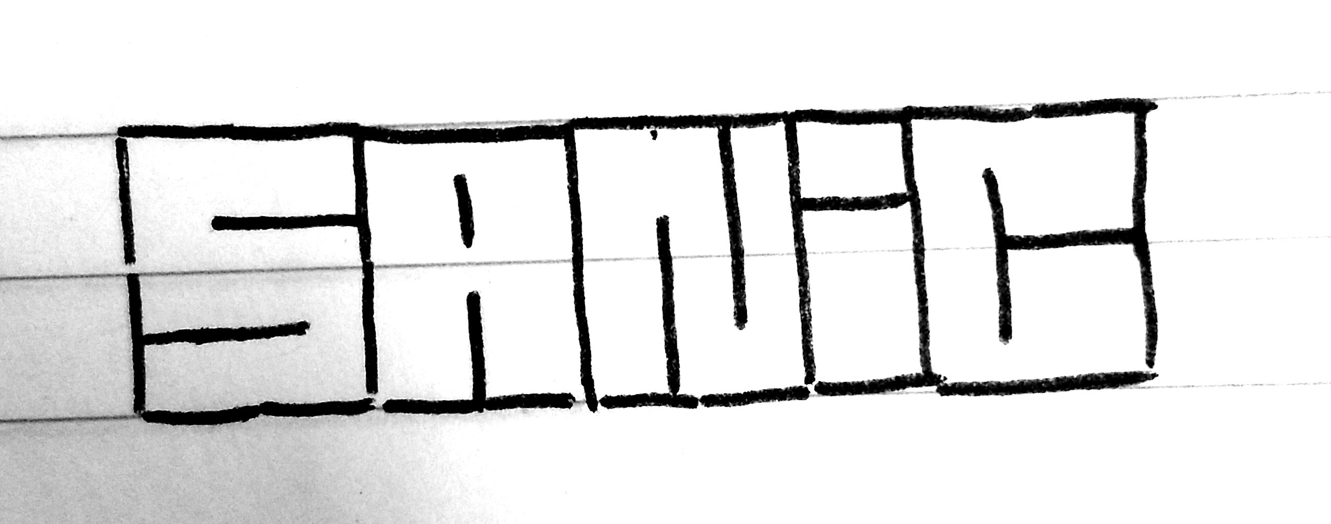
Most simple concept, all letters are uniform.


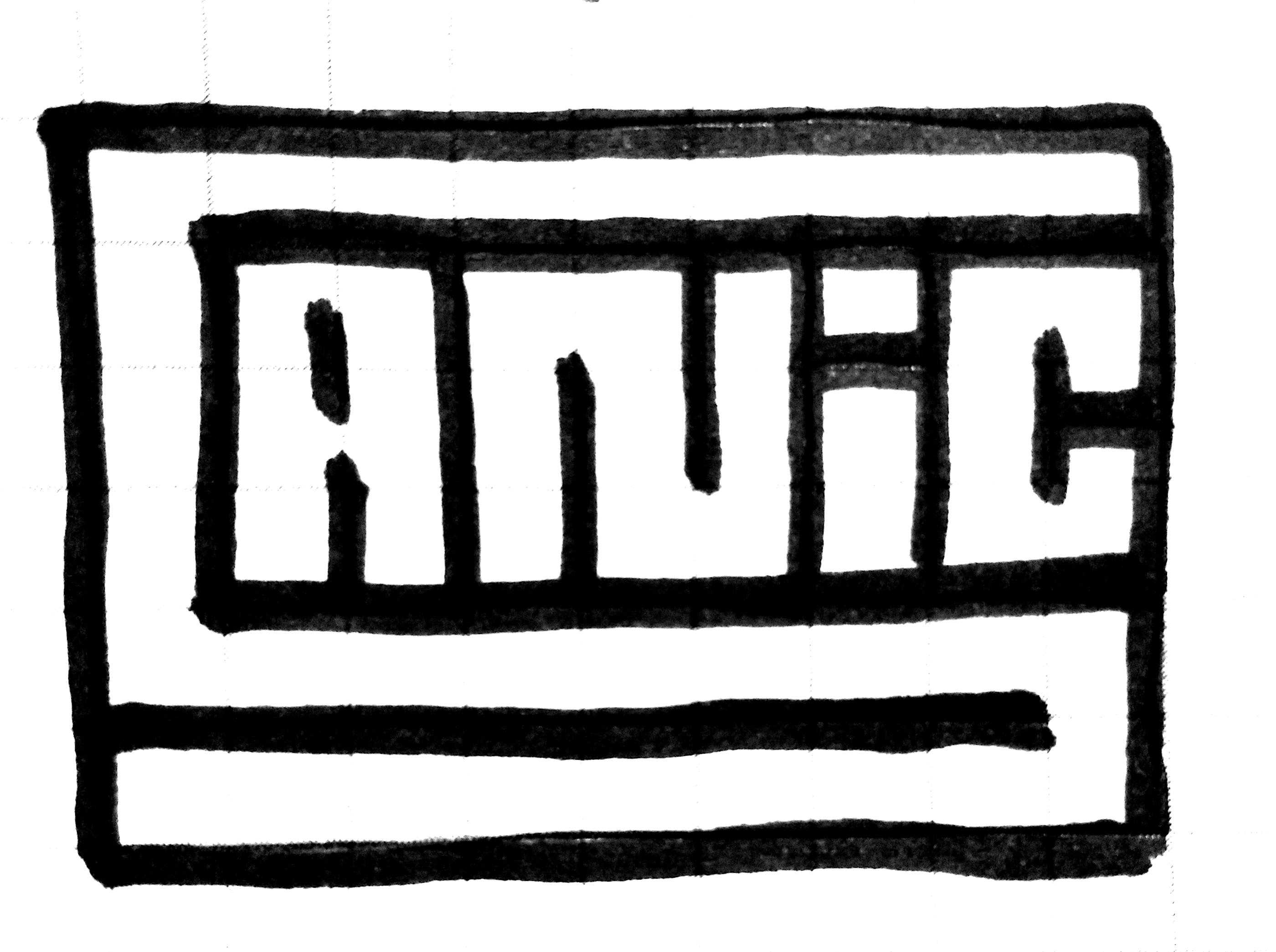
A more “squared” idea, with the “S” letter evolving the rest of the word (“anic”)


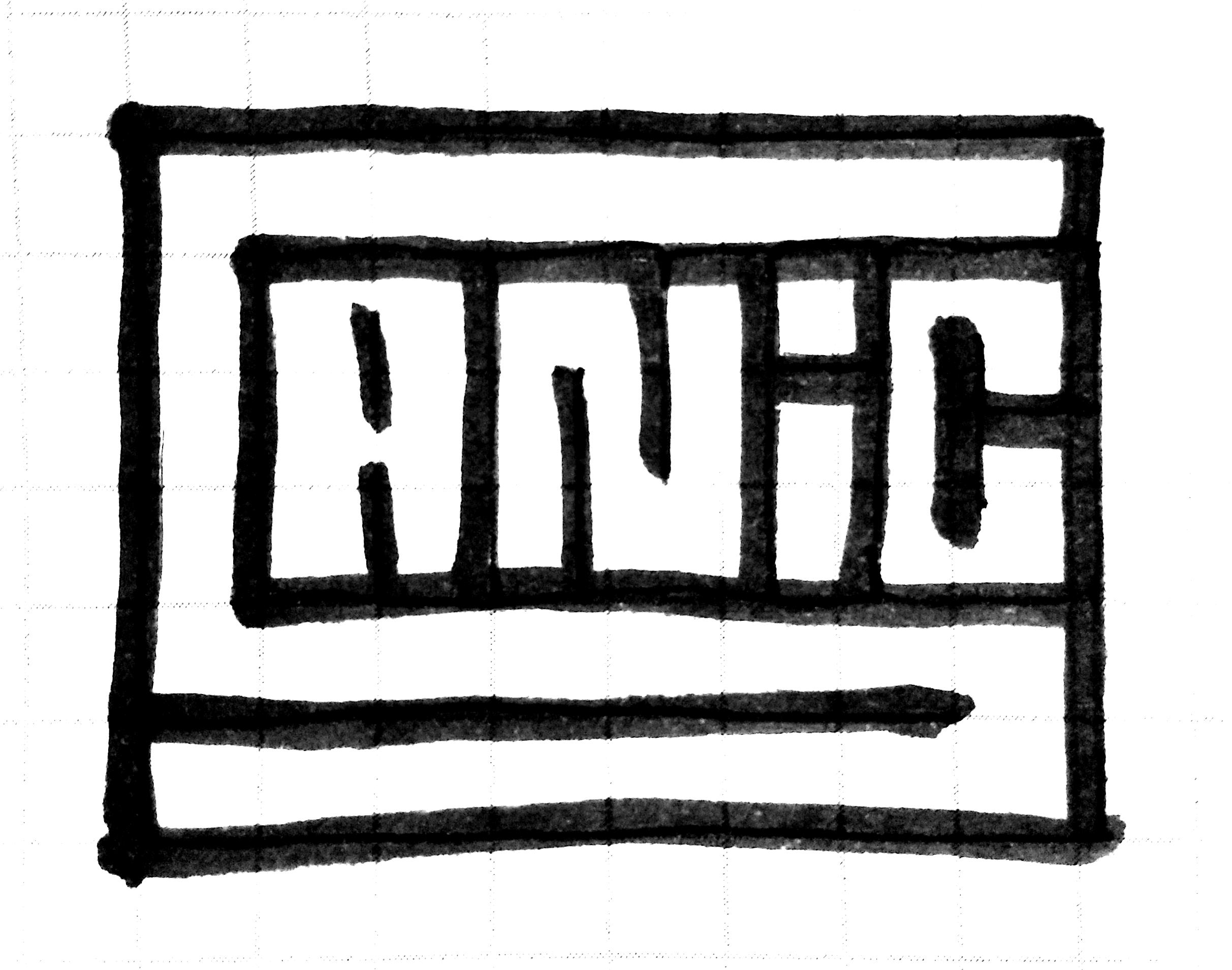
The same as above, more compact.

Let me know your thoughts :wink:

1 Like

I kind of like the second/third. They’re the right kind of ridiculous.

1 Like

Between 2 and 3, my personal opinion is 3 for being more square.

1 Like

Neither of them… Prefer the original sanic logo

The problem with the original is that it is not “original” to the project and may come from somewhere else. The “rebranding” is to bring a renewed sense of professionalism, without any risk of potentially infringing upon any other rights.

No to mention that the “original sanic logo” is in fact the avatar of the original author, @channelcat. So, in fact, we’re not creating a “new project logo”, we are creating “the project logo”.

1 Like

I’m starting to become really fond of your sincere words :sweat_smile:

1 Like

cool logo ideas! Dumb question though why keep the name “sanic” if we are dropping the hedgehog logo? When I first came to the project I didn’t get the name until after I saw the logo

Well … First because the hedgehog mentioned has a slightly different name. We all know that a lot of things in “Sanic” came from memes regarding this character over the internet, like the (catchy) “gotta go fast” phrase, etc. We just want to get away a little from it because, well, there’s a whole copyright world out there that IMHO would be nice to just avoid any kind of collision :grimacing:

I am not a lawyer but I don’t really see how an (original?) ascii version of the sonic character is any less fair use than the misspelled “sanic” or the “gotta go fast” catch phrase. I think on one hand if we completely rebranded we have the lowest possible risk of running into copyright issues but on the other I feel like we don’t want to rebrand because we could loose some user base in the process

I agree with you in terms. Even though “Sanic” may be a mispelled version of “Sonic”, it is also a valid word, so no problem about that. “Gotta go fast” is the theme song of Sonic X if I recall correctly, but the “meme” version use the phrase “gotta go faster”.

Anyway, in the other hand, we still have the weird, Sonic resembling, hedgehog character that is in fact @channelcat’s avatar (it suited well as a brand for Sanic for quite some time, I admit).

Not only to avoid some “legal problems” in the future, but to also give Sanic an identity of its own (and not @channelcat’s), since we are now a community based project :wink:

Allright, here are some updates regarding the logo. In fact, this is just another alternative for us to think about:

The logo

Detailed view

sanic-logo-idea-2

Normal view

sanic-logo-idea-2-sm

Small view

sanic-logo-idea-2-frwk-nano

Nano view (without “framework”)

sanic-logo-idea-2-nano

Icon

Detailed view

sanic-icon

Normal view (~100px)

sanic-icon-sm

64x64

sanic-icon-64

32x32

sanic-icon-32

2 Likes

@vltr The new set of logos look brilliant. I can imagine myself having a bunch of stickers with few of these logos stuck on my laptop.

My only criteria for a logo, “Does it look good on my laptop?”

4 Likes

What, we can’t use one that looks like it was half-assed on graph paper?

Seriously though, I do like the new ones.

Sounds decent enough threshold for me :rofl:

2 Likes

I really like that criteria! :rofl:

Two questions:

  1. So, what’s the next step for adoption? Is anyone opposed to changing the logo to something like what @vltr is proposing?
  2. Do we add colors? I personally like the dark grey/light grey. But, a pop of some color might be nice. Honestly though, I am terrible at these things.

Well, my friends just sent me the black and white drafts. There’s the idea of adding colors, of course, he just would like to know if we have a preferred color scheme or even a preferred color so he can work on it.

Well… black and white render faster, right?

:grin: does it? then yeah, do that.