I like the sound of this.
@LaughingBubba I like the tag line. Thanks for sharing the idea.

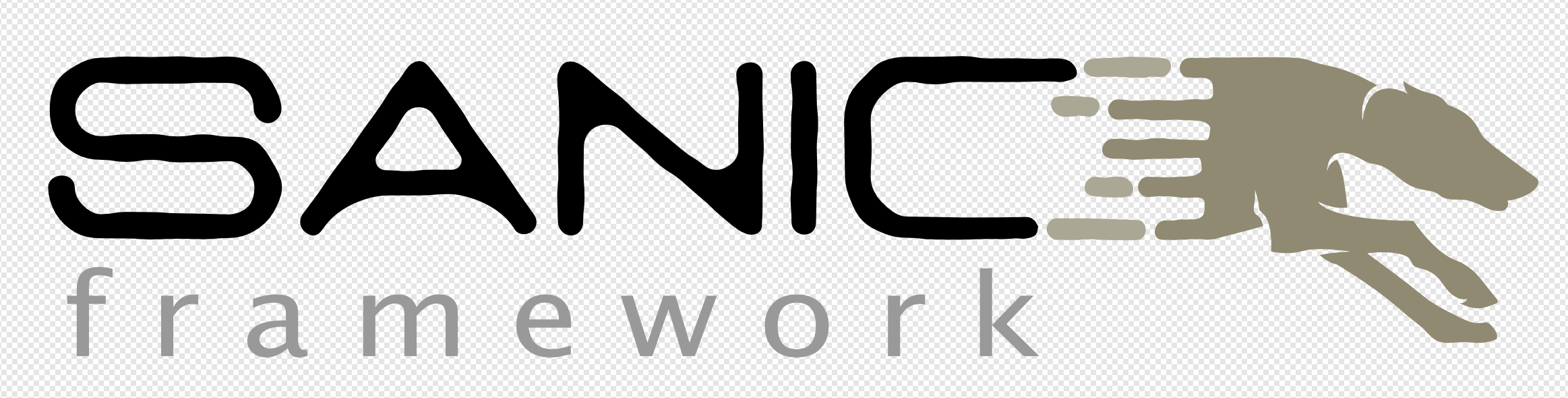
@LaughingBubba I got an idea from a friend to use a greyhound (since dogs are friendly, plus greyhounds may look funny sometimes) to build some kind of “mascot” for Sanic. Going here and there, with some of your sketches, I ended up spending some time myself on inkscape … And this is the result, so far (I’m open to suggestions!):

My impressions, FWIW,
I think it’s quite hard to please everyone … I’m almost thinking that the logo should be a simple code. Not some SVG code, just sanic, monospaced 
Hey… it works for Google…
Yeah, well, the first Google logo was almost a WordArt, so … I just thought we could get a head start on that 
- The S with a line evokes a currency symbol: $
That’s why I never continued with that idea.
I gotta say I really like the font and the dashed lines. I see where you’re going with the greyhound.
I don’t dislike it but it doesn’t quite resonate. I don’t suppose you could post the SVG up some where? 
Sure. The SVG you can download here. The font face I used was Navy Queen, you can download it from here. I was thinking on go with the dashed lines here in there within the logo itself, doing some extra work on the S character, perhaps having a 1:1 ratio so it could be used as the icon as well.
Thanks! what was the font you used on the “framework” tag it seems foreshortened.
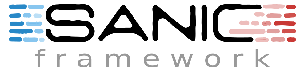
I was just going to enclose the SANIC title with dashes and make one side slightly red and the other slightly blue aka Doppler effect and subtle reference to sanic meme
Nice! That might sound awesome. The font face I used for the “framework” part is Polly. Sorry that I missed it. You can download it here.
Yup that fixed it. Cheers.
Here’s my attempt

The files can be found here. I used a trial version of Affinity Designer to update the SVG and re-export as I was having troubles getting Inkscape to run on my MBP.
I really like that idea. I’m thinking about playing with it a little bit more. The framework font face I picked up randomly, we can use everything in upper case as well …
That looks really cool. I like how a slightly extended upper line of C adds a special vibe to the logo. (I do miss the greyhound  but that’s more of an inner conflict)
Looking forward to seeing what you come up with 
Sorry for being late to the party here … I have had a ridiculous few weeks (new baby, started building a house, and some crazy last minute deadlines).
I will try to summarize my thoughts in relation to a few things:
S (if it is not already) for usage as a 1:1 logo.C a little more so it is not as square looking:I really like the doppler effect idea introduced by @LaughingBubba
Yeah, me too! I made some changes today and I hope I can put something here tomorrow with that idea in mind, with the S being 1:1 